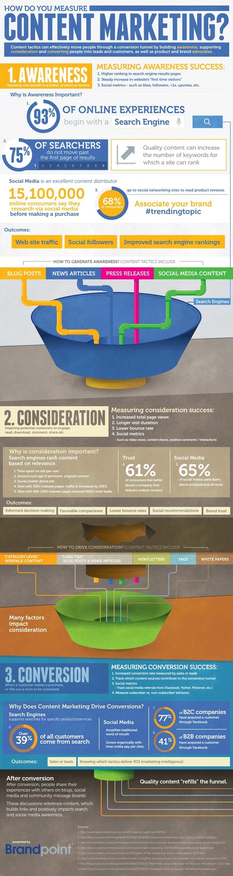
This infographic recommends three broad areas to evaluate when assessing content marketing success. With more than 90% of companies now doing some form of content marketing, the logical question is: how do you know if you’re doing it well?
In terms of “what” to measure, this infographic from Brandpoint recommends three broad areas to assess:
• Awareness (e.g., search engine rank for target keywords, social metrics such as likes and followers);• Consideration (longer average visit duration, social shares); and• Conversion (increased conversion rate, growth in newsletter subscriptions).
In terms of “how” to measure success, CMOs utilizing a sophisticated web presence optimization framework for maximizing content marketing results will likely embrace tools for measuring competitive multi-channel marketing metrics—not just “are we making progress?” but also “how are we doing compared to our competitors?”
Read more at the article link...
Via
Lauren Moss


 Your new post is loading...

![13 Blogging Statistics You Probably Don’t Know, But Should [Infographic] | Ukr-Content-Curator | Scoop.it](https://img.scoop.it/12jx8ohM_6GOXKHyjLtSWTl72eJkfbmt4t8yenImKBVvK0kTmF0xjctABnaLJIm9)


![Content Curation 101 [infographic] | Ukr-Content-Curator | Scoop.it](https://img.scoop.it/FxUKXJ5O0JjDVHM_XaDm-zl72eJkfbmt4t8yenImKBVvK0kTmF0xjctABnaLJIm9)


![Curation: 1,000,000 people and businesses are now using Scoop.it! [Infographic] | Ukr-Content-Curator | Scoop.it](https://img.scoop.it/Ee9FoNhWlvtiqjVi2wlGrzl72eJkfbmt4t8yenImKBVvK0kTmF0xjctABnaLJIm9)


Blogs are powerful tools serving various commutation and education purposes. Wish to multiply the benefits? Read carefully the info graphic above and good luck!
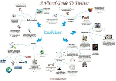
This infographic shares some excellent information for bloggers on how to increase your audience/followers.
This infographic should be of interest to bloggers.